Hello! I'm back today with my final card for 2018. I'm feeling the rush of the end of the year as much as everybody, so I went back to my bread and butter (Clean and Simple) for this one.
I stamped my image and then colored it using my Copics. Since it was just one image, I just fussy cut around it with my scissors and set it aside. I cut and folded my card base and then used a dotted embossing folder to create the texture on the front. I brought my MISTI back out to stamp the sentiment on a strip of black card stock and then heat embossed it with white powder. I used my foam tape to adhere both the sentiment strip and the image. Super simple, but still a fun card to cheer someone up!
Thanks for stopping by today!
Supplies
Compensated affiliate links used when available.
Saturday, December 29, 2018
Sunday, December 23, 2018
Looks Like Christmas
Hi, everyone! I'm back today with a card I made as a member of the Kindred Stamps Design Team. I thought one more Christmas card would be fun, so I created this one for another one of my nephews.
I'm still going through Sandy Allnock's City Sidewalks class, so I created this one using the third lesson. I don't want to give away too much since it's her class, but I thought I'd show you how I start the card by sketching in my scene with a light marker.
It's kind of amazing how this weird looking sketch turns into the scene I created. This sketch just helps me figure out where all of my elements are going to be. Then I go in with my markers and gradually add darker and darker colors until I get the end result you saw above.
Here it is about halfway through the process. I've started adding more detail, but it's still unfinished with a long way to go. And I always have to remind myself to keep going because it won't always look this blobby.
So you can see by the end result that layers of color really bring the scene together. I finished it all off by adding some snowfall with my white gel pen. I added my sentiment using my MISTI and I was all done!
Thanks for stopping by today and I hope you have a wonderful holiday!
Supplies
Compensated affiliate links used when available.
Tuesday, December 18, 2018
CASology: Holly
Hello! I'm here today with a new cue from CASology! It's another two week challenge, so you'll have plenty of time to participate. And it's another holiday theme, so it'll be easy to fit into your holiday crafting!
I created a fun holiday cocktail card by using my holly as a garnish! I used a sentiment from the Sassy Pants Holiday sentiment set from MFT and the little holly image is from Santa's Elves. The glass itself is from a discontinued set called Holiday Cocktails. But any cocktail glass image in your stash would work for this one!
I used my MISTI to figure out where I wanted to place all of my images and then carefully removed the cocktail glass leaving only the sentiment and the holly. I stamped the two together on a panel and then used masking paper to mask off my holly image. I went back in with my MISTI and then stamped my cocktail glass so it would appear that the holly was on the rim. I removed my mask and I was ready to color!
I decided that I wanted a strawberry margarita in my glass, so I started to color by dotting in some R20 to fill my glass. To add dimension, I went back in with R24 and R22 to add more dots of color to look as though it was slushy. I colored in my holly and then used my cool grays to add some dimension to the glass itself. When I was satisfied with the look, I used my warm grays to add a bit of grounding below the image and then used my cool grays to add a halo around the glass. This made it easier for my sugar around the rim of the glass to stand out against the white paper when I went back in with my gel pen to add the detail.
I finished everything by adhering my colored panel to an A2 size card base.
Thanks for stopping by and don't forget to add your creations to the CASology post!
Supplies:
Compensated affiliate links used when available.
I decided to go a little outside the box for this one...
I used my MISTI to figure out where I wanted to place all of my images and then carefully removed the cocktail glass leaving only the sentiment and the holly. I stamped the two together on a panel and then used masking paper to mask off my holly image. I went back in with my MISTI and then stamped my cocktail glass so it would appear that the holly was on the rim. I removed my mask and I was ready to color!
I decided that I wanted a strawberry margarita in my glass, so I started to color by dotting in some R20 to fill my glass. To add dimension, I went back in with R24 and R22 to add more dots of color to look as though it was slushy. I colored in my holly and then used my cool grays to add some dimension to the glass itself. When I was satisfied with the look, I used my warm grays to add a bit of grounding below the image and then used my cool grays to add a halo around the glass. This made it easier for my sugar around the rim of the glass to stand out against the white paper when I went back in with my gel pen to add the detail.
I finished everything by adhering my colored panel to an A2 size card base.
Thanks for stopping by and don't forget to add your creations to the CASology post!
Supplies:
Compensated affiliate links used when available.
Saturday, December 15, 2018
She Who Is Brave
Hello! I'm back today with a fun card I created for Kindred Stamps featuring one of the newest releases - I Need Some Space.
I started my card by stamping my girl image and then masking her off. I stamped the police box so it looked like it was behind her and then masked it off as well. I laid my stencil over the piece and used some masking tape to mask off the bottom portion where my ground would be and then used my ink blending tool and my Fired Brick distress ink to blend ink into the stencil to create my wall.
I removed all my masking and used my Copics to color in the ground and the images. When I was satisfied with the look, I used my MISTI to stamp my sentiment on top of the wall like graffiti. I adhered my panel to an A2 card base and I was all done!
Thanks for stopping by today!
Supplies
Compensated affiliate links used when available.
Wednesday, December 12, 2018
Kindred Stamps December Release
Oh my goodness do I have a fun post for you today! You already know that I'm a giant nerd, so it'll come as no surprise as to why I'm in love with these super fun new sets. They feature my favorite time travelling alien and the various forms he/she takes. I've used two sets for my projects - It's About Time and I Need Some Space.
I couldn't wait to make this exact card as soon as I saw the sets. I wanted to put all of them together to show the evolution of the character. I stamped and masked a ton for this one, but it's totally worth it! I colored them all in with my Copics and then added some grounding by adding a little warm gray beneath the images.
I couldn't help myself, I decided to make some tags to go along with this card...
I used some Kraft card stock for the base of these folding tags. I cut each fold-up piece and then stamped an individual time-travelling alien on each one and colored them in. I adhered the folding portion to the tag base and then added the embellishments on top. I finished by adding a little bit of baker's twine to attach them to bags and boxes. It would be super fun to use these for my husband's Christmas presents this year!
Next up, I wanted to do something a little bit outside the box...
I took the evil alien stamp and turned it into a birthday cake masterpiece by adding a little bit of hand-drawn detail with my Copic multi-liner. I drew in the candle and the icing on the top of its head. I colored it in with my Copics and tried to add a little bit of texture by adding some dots to the "cake" portion of its body. I colored some pieces to look like Twizzler details and the "hardware" was turned into chocolate candy pieces. I colored the lights to be yellow gum drops and added some dots with my white gel pen to look like sugar! I added the sentiment below it and I was all finished! I think it would go well with a fun little tag added to a gift for someone's birthday.
For my last card, I wanted to put what I've learned from Sandy Allnock's City Sidewalk Copic class to good use, so I colored up this gorgeous wintery scene.
I stamped my image and then sketched in my scene with a light colored marker so I'd be sure of where I wanted everything to be placed. I went back in and gradually added color to the scnee to darken everything and bring out the details and then colored in my image so the shadows fell on the right side since the lamppost would be lighting the left side. I decided the I didn't want to add a sentiment to the front, so I simply adhered my panel to a top-folding A2 card base to finish it off.
The entire Kindred Stamps December release will be available Friday, December 14th at 8am PST/11am EST. Be sure to check out the Kindred Stamps blog on Friday for the full product release as well as the complete line up of all the Kindred Stamps Design Team projects from release week! If you visit and comment on all of the designers' blogs this week, you could win $15 in Kindred Stamps shop credit! So join the Fan Club and release event, show the design team some love, and get ready to empty those wallets this Friday! Supplies Compensated affiliate links used when available.
Tuesday, December 4, 2018
CASology: North
Hello, everyone! I'm back with a brand new cue from CASology! This one is another two week challenge since we've hit the holiday season and we all seem to get a bit busy this time of year. So you have extra time to play along! And since it is the holiday season, I know you'll be able to fit this into your holiday card-making because the cue is...
I decided to have a little fun with this one and may have gone a little beyond "simple," but I was having way too much fun with my Copics and this idea just took over my brain.
I used inspiration from Sandy Allnock's Winter Wonderland copic class for this one. I took lesson two and merged it with some information from lesson one to create this snowy mountain scene. I personalized it by adding my north pole sign peeking in from the corner!
Thanks for stopping by and don't forget to add your on creations to the link on the CASology post!
Supplies
Compensated affiliate links used when available.
Sunday, November 25, 2018
Keeping Christmas November Inspiration Blog Hop
Hello! I'm joining some delightfully talented ladies on the 25th of every month with a fun Christmas creation. It's our last blog hop before Christmas, so I thought I'd make this one a good one.
Sandy Allnock's Winter Wonderland class was the inspiration for the background of my card this time around. I can't recommend her classes enough. It looks like a complicated drawing, but it literally took me about 20 minutes to create. If you've never taken one of her classes, let me just tell you that even beginners can create masterful looking creations immediately!
Since the background is so light, I drew in the background first (it was actually much larger, I cut it down) and then stamped my images on top and colored them in. Unfortunately, the images I used are from a My Favorite Things set that has since been discontinued. It's still one of my favorites and I find myself reaching for it at this time of year even though I have other, newer sets that I could use. It's just that cute! I trimmed down my piece so that it would fit the front of an A2 card base and then stamped my greeting in Versamark on black cardstock. I heat embossed my sentiment in white powder and then wrapped it around the panel and adhered it down. I used my double sided tape to adhere the panel to a card base and I was all done!
Thanks for stopping by and don't forget to visit the other stops in the hop!
Supplies
Compensated affiliate links used when available.
Saturday, November 24, 2018
Never Grow Up
Hi, everyone! I'm here today with a confession. I'm a bookworm. A big one. I read constantly. And here's another confession, I have a couple of cats. And these cats enjoy things with strings on them. In other words, my cats like to chew on my bookmarks which makes keeping them (the bookmarks, not the cats) in the house a struggle. Fortunately, this hobby and a nifty little die help keep me in homemade bookmarks so I don't go crazy every time they chew one up!
So that's where the inspiration for today's project came from. One of my little rascals grabbed the bookmark from my current book and shredded it. I needed a new one and this set was sitting on my desk just begging to be made into one!
I cut two bookmarks from white cardstock with my die (one to color on and one to adhere to the back to hide any bleeding that might come through). I stamped on one of them and then colored it with my Copics. I even colored the sky to give it a little something extra. I used my Multi Medium Matte to adhere the two bookmarks together. Because it stays wet for a little bit before becoming permanent, I was able to position the pieces perfectly before it dried. I added a little baker's twine to it and I have a new bookmark to keep my place in my current read!
Thanks for joining me today!
Tuesday, November 20, 2018
CASology: Girl
Hey, everyone! I'm back today with a new cue from CASology!
For this challenge, I decided to color up my favorite "wise" girl.
Isn't she adorable!? I just love this cute little stamp from Kindred Stamps. This was a simple one to put together. I simply stamped my image and part of the sentiment in Memento Tuxedo Black using my MISTI and then finished the sentiment by stamping the word wise in Blue Jay ink.
I used my Copics to color in my little wise girl and then grounded her using some warm grays.
Thanks for stopping by today and don't forget to add your own creations on the CASology post!
Saturday, November 17, 2018
Groundbreaking Birthday
Hello! I'm back with a card I created using Kindred Stamps' Fashion Boss set. I just love this stern little lady!
This card required a little bit of work to put together, but mostly because I insisted on inlaying all those little diamonds. It took some time, but I think it was worth it for the beautiful background it makes. I cut this cover die from white, gray, and dark gray cardstock and then layered the white piece onto a white card base. I took the two gray pieces and inlaid them in an alternating pattern.
I stamped my Fashion Boss in Memento Tuxedo Black and then used my Copics to color her in. I cut her out and then set her aside while I worked on my sentiment strip. I stamped my sentiment in Versamark ink and then heat embossed it with white powder so it would stand out on the black. I cut it down so the sentiment would be on the far left of my card and then adhered it to the base with my tape runner. I adhered my image using some thin foam tape for a little bit of dimension.
Thanks for joining me today!
Tuesday, November 13, 2018
CASology: Glass
Hello, everyone! I have a new cue from CASology for you today!
I used what I learned in the "surface" lesson to create a swish of soda in a glass with some caffeinated bubbles as my background.
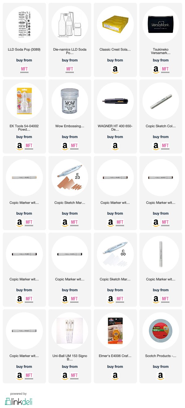
I cut my glass bottle from some Neenah Solar White and then used my copics to color in soda inside of my bottle. I added some bubbly details with my colorless blender, E49, and a white gel pen. I added my sentiment on the label for the bottle and then glued on the bottle cap I had colored in with C5. I added the bottle to the front of my card with some foam tape for dimension.
Thanks for stopping by today and don't forget to add your own creations on the CASology post!
I decided to use what I learned in Sandy Allnock's Underwater Scenes class to create a fun "soda" background for my glass bottle.
I used what I learned in the "surface" lesson to create a swish of soda in a glass with some caffeinated bubbles as my background.
I cut my glass bottle from some Neenah Solar White and then used my copics to color in soda inside of my bottle. I added some bubbly details with my colorless blender, E49, and a white gel pen. I added my sentiment on the label for the bottle and then glued on the bottle cap I had colored in with C5. I added the bottle to the front of my card with some foam tape for dimension.
Thanks for stopping by today and don't forget to add your own creations on the CASology post!
Saturday, November 10, 2018
Thimble Kiss
Hello, everyone! I have a fun card for you today that was created using Kindred Stamps' Never Grow Up set.
I began this card by cutting and folding a top-folding A2 card base from some Neenah Solar White card stock. I used a stamp block and some gray ink to create a patterned paper on the front of my base by repeatedly stamping the small thimble image.
I cut a circular panel with a stitched circle die and then used my MISTI to help me stamp my image and sentiment so that it would be straight. I used my Copics to color in my image and then adhered my circle to my card base using some foam tape for dimension.
Thanks for stopping by today!
Tuesday, November 6, 2018
CASology: Compliment
Hello, everyone! I'm back today with a new cue from CASology!
This is super easy to put together. I cut a panel to the size of the front of an A2 card and then used my MISTI to stamp my image and my sentiment. I went in with my Copics and carefully colored in all those little gumballs and the rest of the machine. I went back in with my warm grays to add some detail below my machine so that it looks as though it's sitting on a counter and not just floating in midair. I adhered my panel to the front of a top-folding card base and I was all done!
Thanks for stopping by!
I have so many sentiments that would work for this one, but I had to go with a pun. I just love them so much!
This is super easy to put together. I cut a panel to the size of the front of an A2 card and then used my MISTI to stamp my image and my sentiment. I went in with my Copics and carefully colored in all those little gumballs and the rest of the machine. I went back in with my warm grays to add some detail below my machine so that it looks as though it's sitting on a counter and not just floating in midair. I adhered my panel to the front of a top-folding card base and I was all done!
Thanks for stopping by!
Monday, November 5, 2018
Kindred Stamps November Release Rock Out
Hello! I'm super excited to share this amazing stamp set from Kindred Stamps with all of you today! As a giant music fan, I'm in love with this one.
I started by creating a birthday card with some dies and a some colored papers.
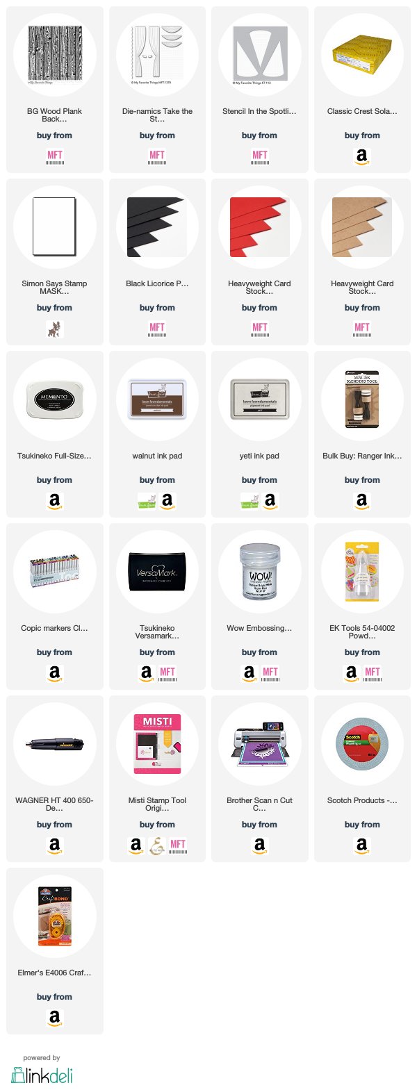
I put together a little stage for my rock star to perform using some colored papers, a wood plank background stamp, and a curtain die. I added some stenciled spotlights to the background to bring the focus onto my image. I colored my image with Copics and then cut him out using my Scan N Cut (you know, I hate fussy cutting!). I adhered all my elements to a card base with my tape runner and then added my rock star using some foam tape for dimension and to make him stand out from the other background elements.
I finished this one off by using my MISTI to heat emboss my sentiment onto the stage below my image.
Next up, a ton of coloring!
I love clean and simple designs and this one is no deviation from that. I stamped my middle rock star using my MISTI and then masked it off with some masking paper. I went back in with my MISTI and stamped my other two images and the sentiment below them.
Now it was time to put my coloring skills to the test! I spent at least two hours coloring my little people for this one. I did quite a bit of blending and experimenting on some scrap paper to come up with the best techniques for hair types and to try to get a "glitter" feel for the far right jacket. In the end, I think the time was well worth it! To finish it all up, I added a bit of shadowing below my images to ground them and then adhered my panel to a card base.
The entire Kindred Stamps October release will be available Friday, November 9th at 8am PST/11am EST. Be sure to check out the Kindred Stamps blog on Friday for the full product release as well as the complete line up of all the Kindred Stamps Design Team projects from release week! If you visit and comment on all of the designers' blogs this week, you could win $15 in Kindred Stamps shop credit! So join the Fan Club and release event, show the design team some love, and get ready to empty those wallets this Friday!
Tuesday, October 30, 2018
CASology: Arithmetic
Hello! It's Tuesday and it's time for a new cue from CASology!
I had to think a little outside the box for this one because I don't really have any number stamps that would work. Instead, I decided to make a simple valentine.
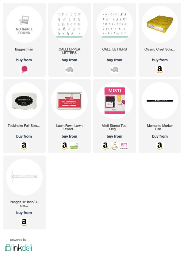
I used my Calli Letters from Mama Elephant to stamp my "you" and "me" and then used my T Ruler and my Memento marker to draw my line beneath them. I then went back in with the marker and added the addition sign. I stamped the my "love" using my MISTI and some Lobster ink from Lawn Fawn.
Super easy! Thanks for stopping by today and don't forget to link up your creations on the CASology post!
Supplies
Compensated affiliate links used when available.
Friday, October 26, 2018
Best Frenemies
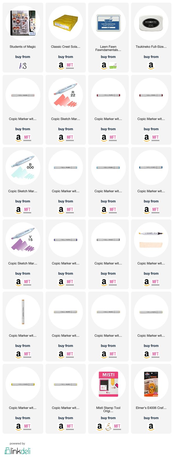
Oh my goodness do I have something fun for you today! I have a card made with a collaboration of Kindred Stamps and Witt & Sass for our week of Magical Friendship. I've combined Students of Magic (Kindred) and Magical Accessories (Witt & Sass) to create something incredibly cute!
I started this card by stamping my images and coloring them in with my Copics. When I was finished, I did a heck of a lot of fussy cutting! I set them aside and began work on my background.
I lightly sketched in my paving stones for my floor using W00 and then went back in and began adding progressively darker colors to create a gradient effect. When I was satisfied with the floor, I went in with my W00 again and sketched in my stone wall. When I was happy with where my lines were, I went in with my darker colors again and added some shading to create a more realistic feel.
I laid out my images where I wanted to eventually adhere them and then used some washi tape to pick them up and keep them together. I added some foam tape to the back of them and adhered them to the panel. When they were set down, I used my MISTI to go in and stamp my sentiment above them. I used some double sided tape to adhere the panel to a top-folding A2 card base.
Thanks for stopping by today!
Supplies
Compensated affiliate links used when available.
Thursday, October 25, 2018
Keeping Christmas Inspiration Blog Hop
Hello! I'm joining some delightfully talented ladies on the 25th of every month with a fun Christmas creation. I don't know about you, but I always find myself rushing to get things done in the couple of months leading up to Christmas. I'm trying to keep that from happening this year by putting together a couple of creations each month to put in my stash so I won't be crazy busy when Christmas rolls around.
It's the 25th, so it's time for a Christmas creation!
I decided to keep it simple this month because Christmas is closing in on us and I wanted something that would be easily mass produced. This card features the Layered Wreath set from Clearly Besotted and it has nothing but simple stamping. I could honestly reproduce a bunch of these in just an hour. I love the simplicity and my overly stressed brain loves it, too!
Thanks for stopping by and don't forget to visit the other stops in the hop!
Supplies
Compensated affiliate links used when available.
Subscribe to:
Posts (Atom)