I sat and stared at this cue for a while before a lightbulb went off and I realized that graffiti often looks like a squiggle to me. Following this weird logic, this design formed in my brain.
I used a heart die that has been discontinued for my "squiggle" graffiti. That makes me sad because I actually really love how it looks. It's like splash of paint, which is so much fun and so versatile!
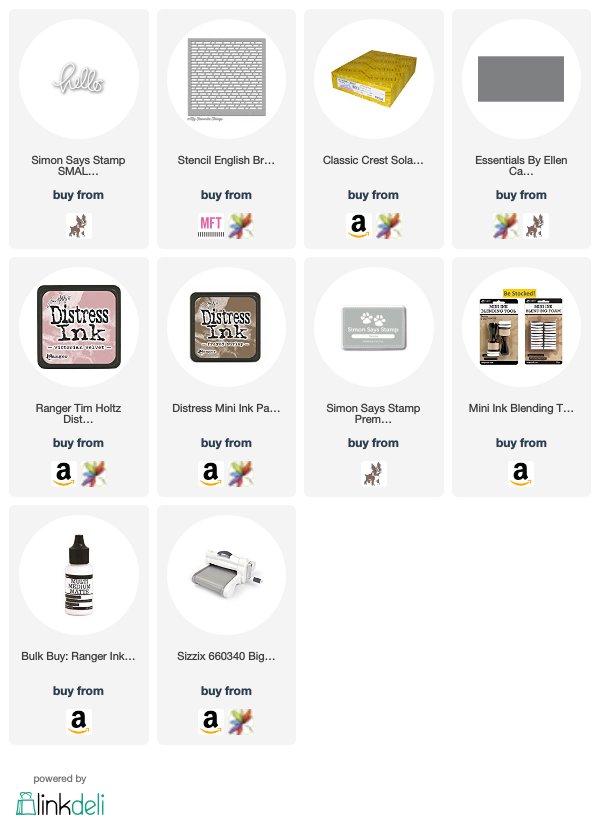
I started by cutting my heart from white cardstock and then using my ink blending tool and some Victorian Velvet distress ink to create a soft haze of color across the image. I then added my stencil to my card base and used another ink blending tool and some Frayed Burlap to softly blend just a hint of brick wall behind where I wanted to place my images.
I added some splatters of Smoke gray ink behind where I was going to layer my images and then adhered my heart die on top with some Multi Medium Matte. I cut my hello die from some Slate cardstock and then used the same glue to adhere it over the top of everything. That's all! Super simple!
Thanks for stopping by today and don't forget to add your creations to the CASology post!


Awesome card, Rachel! I loved the urban feel when I first saw the card - so cool that that was your inspiration!
ReplyDeleteHi Rachel, the graffiti on the stenciled wall with the squiggly heart is amazing. The cut sentiment with the splatter add fantastic interest on the CAS design. Very nice take on the cue word. Happy crafting. Hugs - Bharati
ReplyDeleteI could have sworn I left a comment on this sweet card...I love your squiggly heart and I think it looks perfect against your brick wall, Rachel! Great idea to add a few splatters, too! Another fabulous take on the cue card!
ReplyDelete