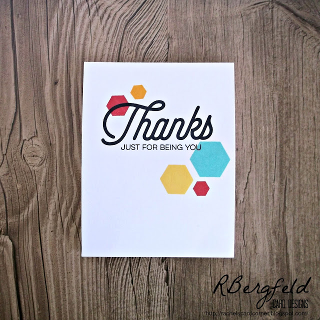
A brand new challenge went up today on Less Is More and I couldn't help but play along. The challenge is to make a one layer card (which I love!) with geometric shapes/patterns. I combined it with the current Color Throwdown to create this!
I started by stamping my sentiment in black ink. I used my Misti so I could re-stamp if it wasn't bold and black the first time. Good thing I did! I actually had to stamp that Thanks 3 times before it looked the way I wanted it to! After the sentiment was perfect, I stamped a few of the octagon shapes in different colors of ink. I kept it simple without any extra embellishment because I liked the look. There's just something so nice about the crisp, clean shapes!
This will be my last "live" post for a week, but I hope you'll be back for my upcoming scheduled posts!


Simply fantabulous!!
ReplyDeleteSuper CAS card. I love how you've used different sized hexagons and the bright colours really make them 'pop'. xx
ReplyDeleteSweet CAS design using the hexagons! Don't you just love the MISTI for repeat stamping?! I never seem to get a larger sentiment to stamp as vividly as I'd like the first time. Thanks for joining us at Color Throwdown!
ReplyDeleteThat font on your sentiment is gorgeous and teaming the flowing lines of it against the angles of the hexagons is a great design. A fabulous card.
ReplyDeleteThanks for joining us at Less is More.
Sharon xx
The font and the octagon stamps are perfectly combined - this is a great layout and a really good example IMO of using CAS elements effectively together. Really nicely done! Hope you have a good trip to Florida x
ReplyDeleteThis looks absolutely super Rachel... simple and SO effective!
ReplyDeleteThanks so much
Chrissie
"Less is More"
Fabulous card,I'd love a misti but there so expensive to ship to the uk, people say it's the imperfections in stamping gives it carm but it drives me nut and clearly the misti is a god send for that, your card looks so clean and crisp I love it,I'm a bit hexagon crazy at the moment,I just love,have a fabulous holiday Debbs
ReplyDeleteI love your style, Rachel!! Great use of the colors for a super fun CAS card!
ReplyDeleteSuper CAS make Rachel, enjoy your holiday.
ReplyDeleteThanks so much for taking part
Anne
"Less is More"
Loving your hexagons Rachel !! Fab card !
ReplyDeleteBeautifully CAS and cool! Have a fab time in Florida :) Great to see you over at Less is More!
ReplyDeleteThis is clean and simple at it's best! LOVE the design!
ReplyDeleteWonderful CAS and OLC!! Love the geometric elements perfectly placed with the sentiment!! So glad you joined us at CTD!
ReplyDeleteCAS and so eye catching, just love your card. Karen x
ReplyDeleteWhat a super geometric design, Rachel!! Congratulations on the well-deserved SHOWCASE at LIM!! Hugs, Darnell
ReplyDelete